I�m working on a project using the new�Telerik UI for�Windows Universal,�specifically the�Rating�control. This control is highly customizable, supporting different shapes and symbols, and is surprisingly easy to modify.
In my case, I was satisfied with the default Star symbol, but needed to modify the color. I expected to see this as a simple property of the Rating control itself, but didn�t see one available in the Properties window nor via Intellisense.
It turns out that the Rating control is a templated control, which is much more flexible than a simple property, as it allows you to intuitively specify different values for different states of the rating elements. According to the current documentation, you can define both an EmptyIconContentTemplate and a FilledIconContentTemplate.
Within each DataTemplate is a single�SymbolIcon�control which in turn exposes the�Symbol�property which itself is actually an�enumeration of Symbols�that give you easy access to various Segoe UI Symbols for use in the app. This is extremely handy as it gives you immediate, intuitive access to literally dozens of symbols and icons in your app.
In my case, the default symbol appears to be �SolidStar� so I kept that and simply changed the�Foreground�property to Yellow, as shown here:
<telerikInput:RadRating IsEnabled="False" Value="{Binding vote_average}" AutoGeneratedItemsCount="10">
    <telerikInput:RadRating.FilledIconContentTemplate>
        <DataTemplate>
            <SymbolIcon Symbol="SolidStar" Foreground="Yellow" Margin="0,3,0,0" />
        </DataTemplate>
    </telerikInput:RadRating.FilledIconContentTemplate>
</telerikInput:RadRating>
I also added a small margin, as the alignment was slightly off in the default state.
Since this is Windows Universal,�running the identical XAML in either app shows the new color in both Windows and Windows Phone:


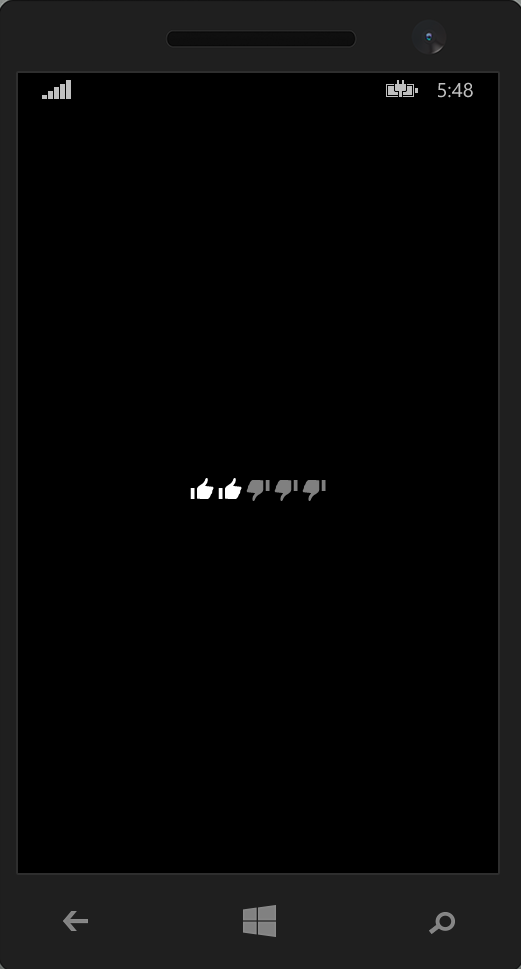
Using this you can easily change both the icon, color, and layout of the rating elements, such as replacing it with thumbs up and down, as shown in this screenshot from the Telerik documentation:

Telerik�s UI for Windows Universal makes it a snap to add helpful controls to both platforms while maximizing code reuse and minimizing the fragmentation of having to build two completely separate UIs. By leveraging the Template in the Rating control we can easily customize the design to match both versions of the app simultaneously.
I look forward to exploring the different available controls, and if there is one you�d like to see covered in detail, please sound off in the comments. As always, I hope this is helpful!