In our previous post we built a UniformGrid container for the ListView, resulting in an evenly-spaced, grid-like view for the main screen of Falafel2Go:
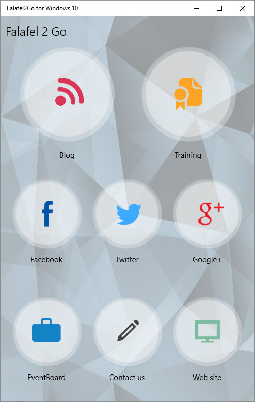
This screen is actually made up of two such ListViews in a RelativePanel, allowing it to reposition the lists to support a landscape view, while still keeping the larger size for the featured Blog and Training activities.
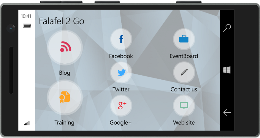
This layout switch�happens automatically as the screen size changes (or, on a phone, if you rotate the screen to its side). Today we'll see how we can achieve similar automation using Blend and the VisualStateManager.
VisualStateManager
A thorough review of the VisualStateManager it outside the scope of this post; for that I recommend you start with MSDN: VisualStateManager class.
But for the purposes of our example, what you need to know is that the VisualStateManager is used to define, manage, and transition between different�states of controls on a page.�Specifically, a VisualState refers to�the collection of XAML control properties which together�define a particular state of the application.
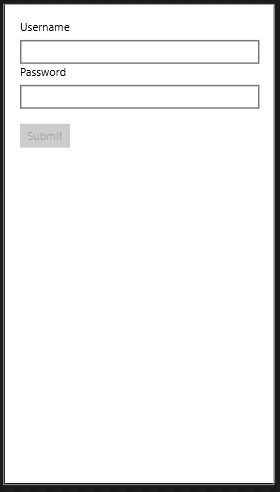
For example, a Registration�screen might show Textbox controls to input the desired Username and Password, as well as a Button control to submit. When the Textbox controls are empty, the Button should be disabled since the form is not valid. Having that button initially disabled would represent one VisualState.
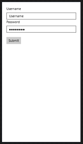
After the user fills in both Textbox controls with values, the Button can then be enabled, representing a different VisualState.
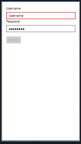
Once the button is pressed, the application my reject the credentials, perhaps because the Username has already been registered. The Submit button could then be disabled again, and the Username Textbox would change to reveal a Red border indicating the error in yet another VisualState:
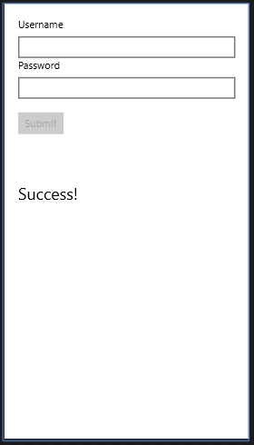
Finally, when the registration is successful, both Textbox controls can be cleared, the Button disabled, and a success message can be shown, revealing the final VisualState for the application:
Now that we understand how Visual States can help define, organize, and transition your UI, let's see how easy it is to create them.
Certainly we could use the code-behind to manipulate the individual properties, but not only is this tedious and error prone, thanks to Blend, it's also completely unnecessary.
Creating Visual States with Blend
As we'll see shortly, Visual States are defined in XAML, and as such it is certainly also possible to construct the complete array of Visual Statues or your application requires manually.
However, you're definitely going to want to instead take advantage of the Blend for Visual Studio companion app that comes with all versions of Visual Studio. As we've seen before, this application is similar to Visual Studio in that you can open the same project and solution for your app to view and edit code, XAML and other resources. But while Visual Studio is optimized for editing code and developer needs, Blend is tailored specifically to managing the design experience.
Arguably one of the most powerful features of Blend is its ability to easily define and manage the Visual States of your application.
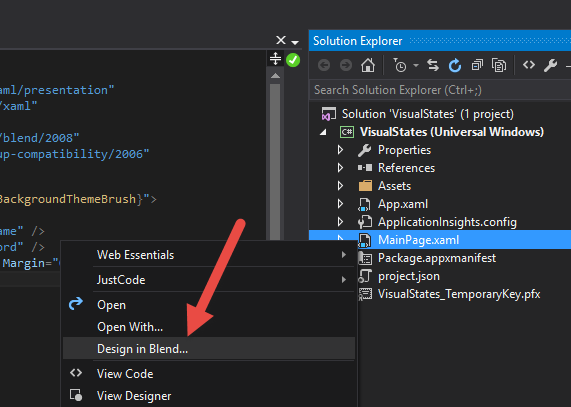
To begin simply open the page you wish to manage in Blend. This can be launched directly from Visual Studio from the context menu:
Then open the�States�window�within�the Blend interface and add a new state group:
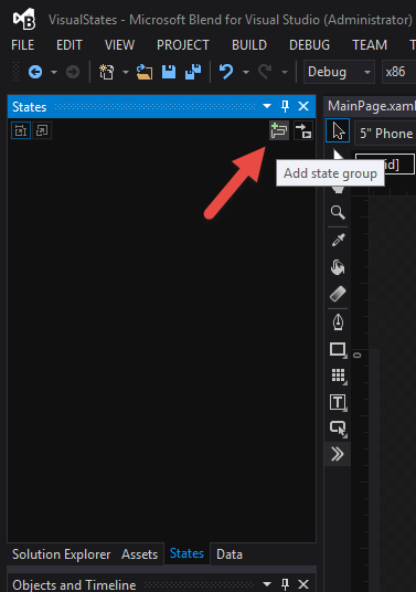
A�StateGroup is a container for the different states of the page. The states within a StateGroup are mutually exclusive; that is, only one can be active at any given time.
Once a StateGroup is declared you can proceed to add one or more VisualStates to the group. For the example app described above, we'll define four states:
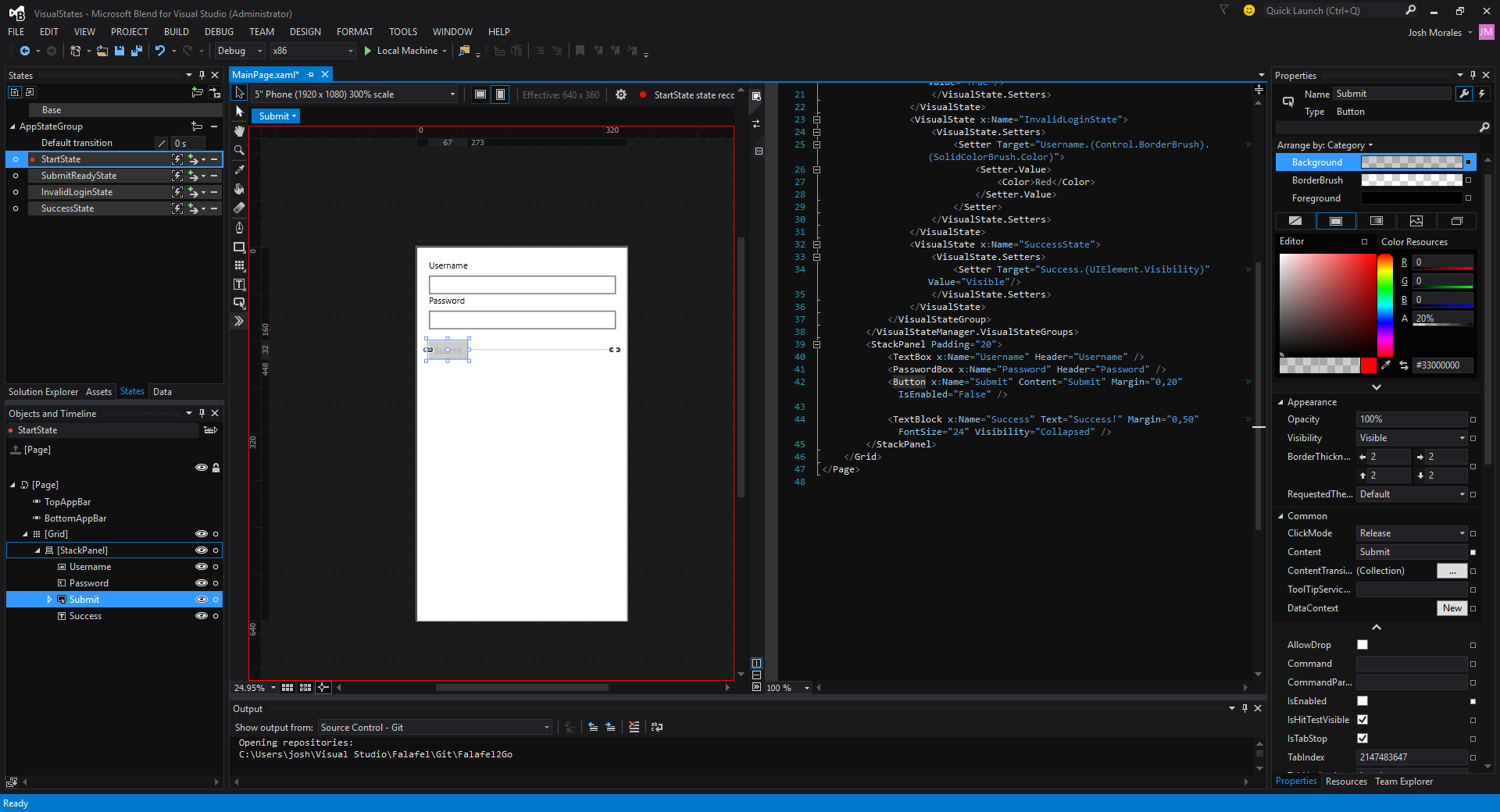
Selecting a state from the menu activates a "recorder", indicated by the red border shown around the designer in the screenshot above. When this is active, any changes you make to the controls on the page with be recorded and saved as part of the currently selected state.
In the screenshot above we've selected the�StartState which if you'll look closely, sets the�IsEnabled property of the button to false. Similar property changes are made for the remaining states to complete the required UI changes.
And as mentioned before, ultimately, these changes are saved as XAML, with Blend doing all the heavy lifting to write out the correct syntax as shown here:
<VisualStateManager.VisualStateGroups>

������� <VisualStateGroup x:Name="AppStateGroup">

����������� <VisualState x:Name="StartState">

�������� �������<VisualState.Setters>

������������������� <Setter Target="Submit.(Control.IsEnabled)" Value="False"/>

������������������� <Setter Target="Success.(UIElement.Visibility)" Value="Collapsed"/>

��������������� </VisualState.Setters>

����������� </VisualState>

����������� <VisualState x:Name="SubmitReadyState">

��������������� <VisualState.Setters>

������������������� <Setter Target="Submit.(Control.IsEnabled)" Value="True"/>

��������������� </VisualState.Setters>

����������� </VisualState>

����������� <VisualState x:Name="InvalidLoginState">

��������������� <VisualState.Setters>

������������������� <Setter Target="Username.(Control.BorderBrush).(SolidColorBrush.Color)">

����������������������� <Setter.Value>

��������������������������� <Color>Red</Color>

����������������������� </Setter.Value>

������������������� </Setter>

��������������� </VisualState.Setters>

����������� </VisualState>

����������� <VisualState x:Name="SuccessState">

��������������� <VisualState.Setters>

������������������� <Setter Target="Success.(UIElement.Visibility)" Value="Visible"/>

������������������� <Setter Target="Submit.(Control.IsEnabled)" Value="False"/>

��������������� </VisualState.Setters>

����������� </VisualState>

������� </VisualStateGroup>

��� </VisualStateManager.VisualStateGroups>
Note that for this to work, the affected controls do need to have their�x:Name properties set, as this is the identifier used by the VisualStateManager to assign the property changes.
Animations
Blend can also help you animate transitions between states, making your app feel more alive by highlighting and focusing user attention on a specific control or activity. In the State window each state has a button to set its transition:
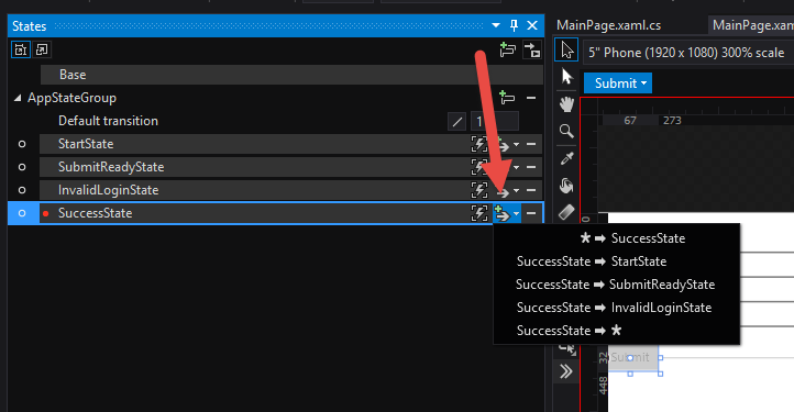
Notice that you can define a separate to and from each state. Selecting one adds a field to set its duration, and also creates a new Storyboard, visible in the Objects and Timelines window in Blend.
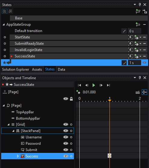
Just as before with static states, the record indicator allows you to set the properties you wish to change, but this time over time. You select the point at which the property should change, then change the property in the designer, which is recorded for playback. You can even preview the animation with the transport controls in the Timeline window.
For our sample, we'll simply animate the Success message by changing it's Opactiy value from 0 to 100 over the period of 1 second, resulting in some new XAML for our page:
<VisualStateGroup.Transitions>

������� <VisualTransition GeneratedDuration="0"/>

������� <VisualTransition GeneratedDuration="0:0:1" To="SuccessState">

����������� <VisualTransition.GeneratedEasingFunction>

��������������� <CircleEase EasingMode="EaseIn"/>

����������� </VisualTransition.GeneratedEasingFunction>

����������� <Storyboard>

��������������� <ObjectAnimationUsingKeyFrames Storyboard.TargetProperty="(UIElement.Visibility)" Storyboard.TargetName="Success">

������������������� <DiscreteObjectKeyFrame KeyTime="0">

����������������������� <DiscreteObjectKeyFrame.Value>

��������������������������� <Visibility>Visible</Visibility>

������ �����������������</DiscreteObjectKeyFrame.Value>

������������������� </DiscreteObjectKeyFrame>

������������������� <DiscreteObjectKeyFrame KeyTime="0:0:1">

����������������������� <DiscreteObjectKeyFrame.Value>

��������������������������� <Visibility>Visible</Visibility>

����������������������� </DiscreteObjectKeyFrame.Value>

������������������� </DiscreteObjectKeyFrame>

��������������� </ObjectAnimationUsingKeyFrames>

��������������� <DoubleAnimationUsingKeyFrames Storyboard.TargetProperty="(UIElement.Opacity)" Storyboard.TargetName="Success">

������������������� <EasingDoubleKeyFrame KeyTime="0" Value="0"/>

������������������� <EasingDoubleKeyFrame KeyTime="0:0:1" Value="1"/>

��������������� </DoubleAnimationUsingKeyFrames>

����������� </Storyboard>

����� ��</VisualTransition>

��� </VisualStateGroup.Transitions>
Finally, you can also specify�"easing" functions for your transitions, which can help them to appear more natural than a simple linear change.
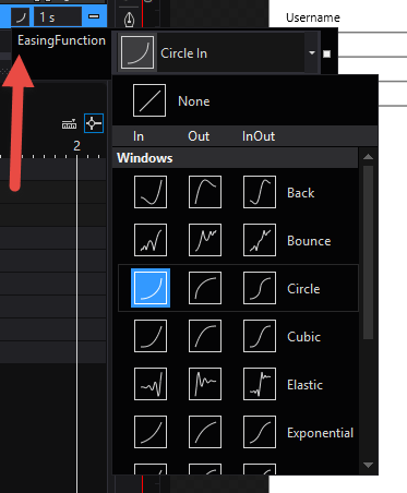
Now that we have the four visual states for our app defined, let's look at one simple way to transition between them.
Changing States with Code
Transitioning states is quite simple; you need only reference the static VisualStateManager object and call the�GoToState method, passing in the parent control, the name of the state, and a boolean to indicate whether or not to use transitions (which we'll look at shortly).
We do this in the constructor to go to the default (disabled button) state:
public MainPage()

�� {

������� this.InitializeComponent();

��� VisualStateManager.GoToState(this, StartState.Name, false);

�� }

Adding additional event handlers to transition between states completes the experience:

�� private void TextChanged(object sender, TextChangedEventArgs e)

��� {

������� if (string.IsNullOrEmpty(Username.Text) || string.IsNullOrEmpty(Password.Password)) return;

������� VisualStateManager.GoToState(this, SubmitReadyState.Name, false);

��� }

��� private void PasswordChanged(object sender, RoutedEventArgs e)

��� {

������� if (string.IsNullOrEmpty(Username.Text) || string.IsNullOrEmpty(Password.Password)) return;

������� VisualStateManager.GoToState(this, SubmitReadyState.Name, false);

��� }

��� private void Submit_Click(object sender, RoutedEventArgs e)

��� {

������� if (Username.Text == "Username")

����������� VisualStateManager.GoToState(this, InvalidLoginState.Name, false);

������� else

����������� VisualStateManager.GoToState(this, SuccessState.Name, true);

��� }
Note that for the Submit button, when we navigate to the SuccessState, we want to make sure to enable the transitions so that the state is revealed with the animations we expected.
The complete project sample is available below for download so you can try it for yourself.
Wrapping Up and Next Steps
Blend makes it easy to create various visual states for your application, and even lets you quickly add animations and transitions to help your app feel more alive and natural. You can easily change between different states, grouping the properties and behaviors together that define the various states of your application.
You can grab the full source of the completed sample project here:
Get the CODE!
However, you have no doubt noticed that we've taken a step back from our MVVM approach by manually triggering the states in the code-behind. To ensure that we're maximizing the reuse of our code and minimizing the platform-specific code we have to write, we want to leverage the MVVM pattern and have these states either be triggered by a ViewModel command, or better yet, have these behaviors defined fully declaratively in the XAML.
We'll see how this is done in our next post. Until then, as always, I hope this was helpful, and thanks for reading!