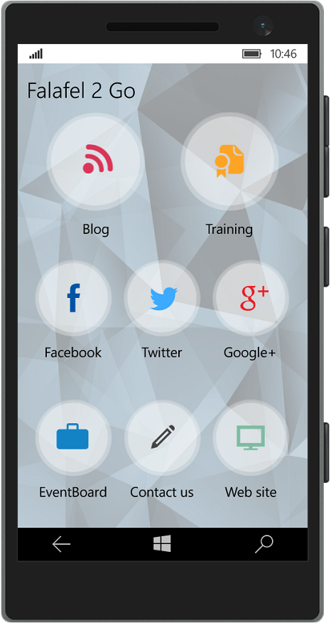
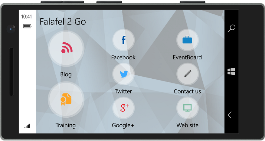
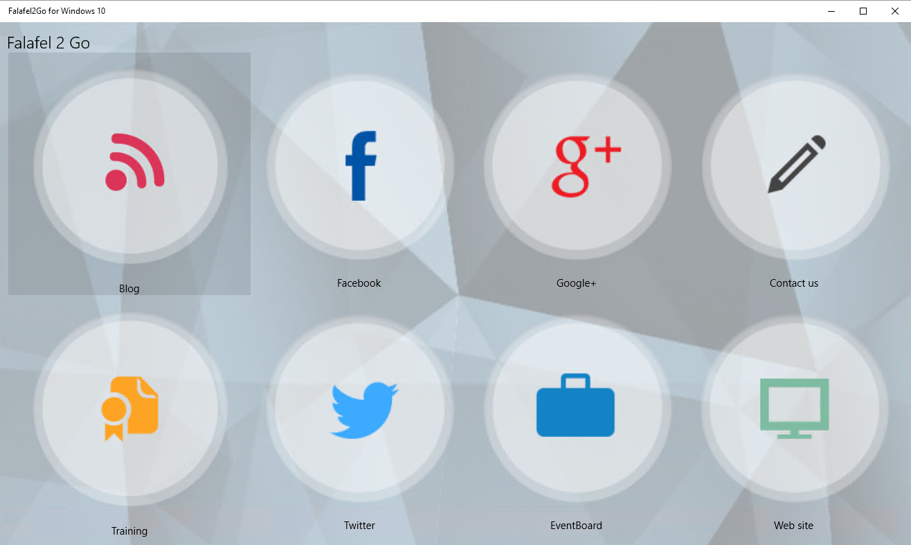
Another new control in the Windows 10 Developer toolbox is the RelativePanel, a layout container which enables flexible positioning between the elements it contains. Today we'll take a closer look at this control and how we used it to build the UI of the Falafel2Go app for Windows 10.
RelativePanel Positioning
Using the RelativePanel, each element it contains can specify its position in relation to either another element, or docking to the container itself. By leveraging these position properties, you can easily create dynamic layouts in a wide variety of configurations, without having to modify the structure of your original XAML or having to create multiple versions for different layouts. The layout options are exposed as attached properties to the parent RelativePanel (similar to the Grid.Row and Grid.Column properties for organizing elements within a grid).
Alignment Options
There are two ways you can align elements inside a relative panel. The first is to use the properties that bind an elements position relative to the container itself, such as:
AlignTopWithPanel
AlignBottomWithPanel
AlignLeftWithPanel
AlignRightWithPanel
AlignVerticalCenterWithPanel
AlignHorizontalCenterWithPanel
These properties are equivalent to the VerticalAlignment and HorizontalAlignment properties, but represent the positioning of elements specifically in the RelativePanel. The real power of the RelativePanel comes from combining these options with the properties that specify positioning in relation to other elements within the control. These are:
Above
Below
LeftOf
RightOf
Besides relational positioning of the controls, you can also specify an alignment so that the controls instead "line up" other items, using these properties:
AlignLeftWith
AlignRightWith
AlignTopWith
AlignBottomWith
AlignVerticalCenterWith
AlignHorizontalCenterWith
In order for these properties to work, each control must have its x:Name�property set, so that you can specify which control to which a control should align its position. For example, in Falafel2Go, we have an ActivityControl that represents the menu buttons on the home screen of the app:

This is made up of two elements (Image and TextBlock) inside of a RelativePanel, and here is the markup for the control:
<RelativePanel d:DataContext="{Binding Blog}" ScrollViewer.VerticalScrollBarVisibility="Disabled">

� ������<Image x:Name="Icon" Source="{Binding Icon}" RelativePanel.AlignHorizontalCenterWithPanel="True" RelativePanel.Above="Text" Stretch="Uniform" RelativePanel.AlignTopWithPanel="True" />

������� <TextBlock x:Name="Text" RelativePanel.AlignBottomWithPanel="True" RelativePanel.AlignHorizontalCenterWithPanel="True"

��������������� Text="{Binding Title}" RelativePanel.AlignVerticalCenterWithPanel="True" VerticalAlignment="Center" />

��� </RelativePanel>
Notice that the Icon control uses the�x:Name property of the "Text" control to position itself above it. By doing this we ensure that both the Text control locks to the bottom (using the�AlignBottomWithPanel) and that the Icon control then lies directly above it, and uses the remaining area of the control, stretching to fill it.
Changing Position
Now at this point you're probably wondering why we bothered to use the RelativePanel when a Grid would have worked just as easily (and probably been a lot cleaner with simpler markup). While it is true that the Grid can be a better choice for a control like this, the Grid relies on Rows and Columns to position items. This makes it difficult to change positioning, since the new locations must also align within the defined grid.
The RelativePanel on the other hand, makes it easy to move elements around by simply changing the appropriate position properties of the controls to be moved.
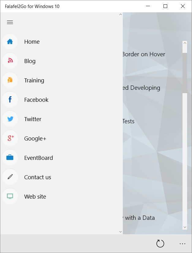
This is best demonstrated by the navigation control in Falafel2Go:

If you look closely, you'll notice that the menu items are identical in content to the activity buttons on the main screen (shown in the screen shot above). The only difference is that the icon is smaller, and positioned to the left of the label, instead of above.
Since the only difference between these controls is the position it made sense to use the RelativePanel, and now�we can reuse the exact same controls for both the home screen and navigation.
However, the ActivityControl is itself a UserControl, as there are multiple instances of it on a page (one for each activity). As a result we don't have a simple way to orient the position from the parent Page.
One way might be to expose custom properties for each control (Icon and Text) to pass the layout positioning from the page to the control. However, this proved to be an awkward and unintuitive solution, and certainly wouldn't scale if we decided to add more controls to the Activity buttons later.
Instead, we started by adding a new�Orientation property to the ActivityControl, giving the page a simple way to specify the layout position of the controls. But how do we actually use this to control the layout?
Recall that since the properties related to the RelativePanel positioning are actually attached properties, we can't simply refer to them directly in code. So trying to do something like�Image.Above�would result in a compiler error.

We solved this problem by taking advantage of the way that XAML uses�dependency properties.
Dependency Properties
A full discussion of dependency properties is outside the scope of this article, but you can certainly learn more by starting here on MSDN:�Dependency properties overview.
All you need to know for the purposes of what we're doing here is that dependency properties are what are responsible for binding the values of things like databinding and attached properties. A dependency is registered and the framework handles keeping everything in sync, allowing you to simply declare the binding or attached property in XAML... But how do we set these properties in code?
The answer is found here:�Attached properties overview. By using the SetValue,�GetValue, and�ClearValue�methods on a control, we can programmatically change these values, which we do in the setter of the�Orientation property:
private Orientation orientation = Orientation.Vertical;

��� public Orientation Orientation

��� {

������� get { return orientation; }

������� set

������� {

����������� orientation = value;

����������� if (orientation == Orientation.Horizontal)

����������� {

��������������� Text.Margin = new Thickness(12, 0, 0, 0);

��������������� Icon.ClearValue(RelativePanel.AboveProperty);

��������������� Icon.ClearValue(RelativePanel.AlignHorizontalCenterWithPanelProperty);

��������������� Text.SetValue(RelativePanel.RightOfProperty, Icon);

��������������� Text.ClearValue(RelativePanel.AlignBottomWithPanelProperty);

����������� }

����������� else

����������� {

��� ������������Text.Margin = new Thickness(0);

��������������� Icon.SetValue(RelativePanel.AboveProperty, Text);

��������������� Icon.SetValue(RelativePanel.AlignHorizontalCenterWithPanelProperty, true);

��������������� Text.ClearValue(RelativePanel.RightOfProperty);

��������������� Text.SetValue(RelativePanel.AlignBottomWithPanelProperty, true);

����������� }

������� }

��� }
Since we defaulted the value to Vertical, on the main screen we simply display the control:
<ctrl:ActivityControl DataContext="{Binding Facebook}"�� />

<ctrl:ActivityControl DataContext="{Binding Twitter}"��� />

<ctrl:ActivityControl DataContext="{Binding Google}"���� />

<ctrl:ActivityControl DataContext="{Binding Eventboard}" />

<ctrl:ActivityControl DataContext="{Binding Contact}"��� />

<ctrl:ActivityControl DataContext="{Binding Website}"��� />
While in the NavigationControl, we set the layout to be horizontal (note we also exposed a size property to render the image smaller):
<ctrl:ActivityControl DataContext="{Binding Home}" Orientation="Horizontal"� IconSize="50" />

<ctrl:ActivityControl DataContext="{Binding Blog}" Orientation="Horizontal"� IconSize="50" />

<ctrl:ActivityControl DataContext="{Binding Training}" Orientation="Horizontal" IconSize="50" />

<ctrl:ActivityControl DataContext="{Binding Facebook}" Orientation="Horizontal" IconSize="50" />

<ctrl:ActivityControl DataContext="{Binding Twitter}" Orientation="Horizontal" IconSize="50" />

<ctrl:ActivityControl DataContext="{Binding Google}" Orientation="Horizontal" IconSize="50" />

<ctrl:ActivityControl DataContext="{Binding Eventboard}" Orientation="Horizontal" IconSize="50" />

<ctrl:ActivityControl DataContext="{Binding Contact}" Orientation="Horizontal" IconSize="50" />

<ctrl:ActivityControl DataContext="{Binding Website}" Orientation="Horizontal" IconSize="50" />
By setting the appropriate properties based on the orientation we now have a slick, reusable control that fits two completely different layout needs without having changed�a single line of XAML in the original control.
Falafel2Go uses the RelativePanel to create a reusable and responsive navigation, maximizing code reuse by changing the relative properties to fit the required layout.
However if you have a sharp eye, you probably noticed that the main screen itself is also a relative panel, allowing the activity controls to position�themselves based on the screen size and orientation. �


In order for this to work, however, we need to ensure that each control is the exact same size. We'll see how this was done in the next post.
Wrapping Up and Next Steps
The new RelativePanel in Windows 10 is a�powerful and flexible container control, allowing you to specify positioning of its elements relative to�each other and/or the container itself. The attached properties offer an intuitive, declarative syntax for laying out the UI, and automating these properties allows your layouts to be flexible and dynamic.
In our next post, we'll create a UniformGrid that allowed us to orient the activity controls on the main screen so that they scale to accommodate any screen size.
Until then, as always, I hope this was helpful, and thanks for reading!