Now that we have a simple but solid foundation for a complete Windows 10 app, let�s take a tour through some of the brand new controls available on the platform. Today we�ll look at the SplitView control, which enables you to quickly create a consistent, intuitive navigation UI that can automatically adjust to different screen sizes and device platforms.
SplitView
The most common function of the SplitView control is to provide a familiar, responsive navigation structure to an application. As the controls name suggests, it consists of two separate views, with a larger Content view to contain the main content of the screen, and a smaller, docked Pane section generally reserved for your navigation menu.
The Windows 10 version of Falafel2Go takes full advantage of this control and serves as a great example of how you can use the SplitView for navigation. Here�s what it looks like on the desktop, with the Pane section collapsed to a traditional vertical sidebar menu.
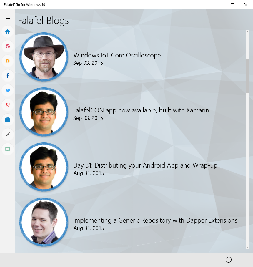
The menu button shown triggers the menu to expand and reveal more context about the navigation options:
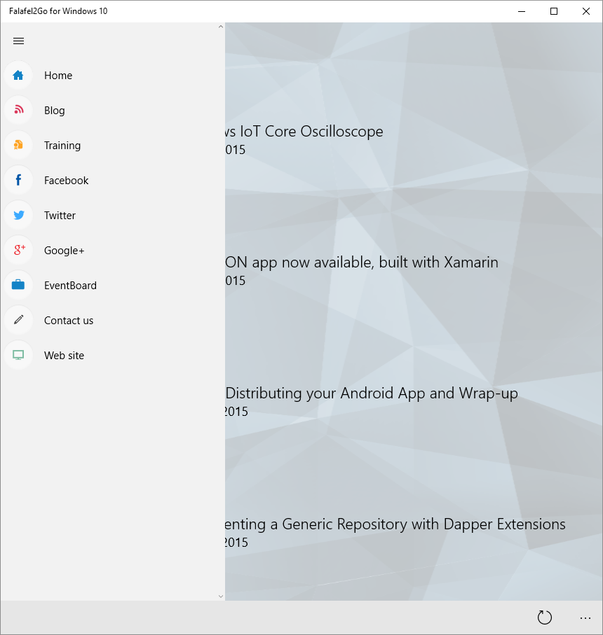
However, the SplitView offers many configuration options to present the control in different ways depending on the UI required by your app.
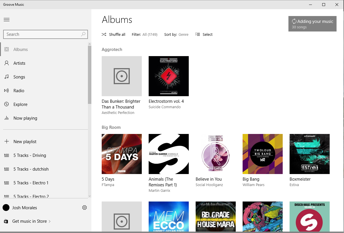
For example, the Pane can be expanded by default to expose a more interactive side bar, as demonstrated by the Groove Music app:
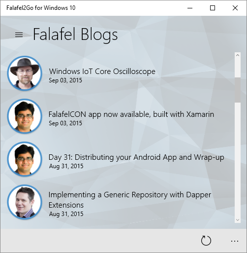
Or collapsed down to a button to support smaller and mobile devices:
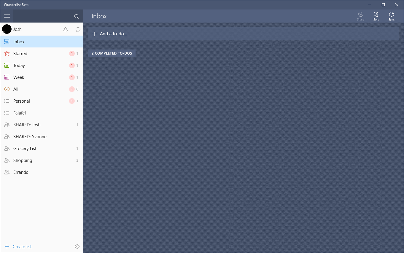
However, the SplitView isn�t limited to just navigation. Many�apps make creative use of the Pane section to add more context and interaction to the main Content section, as shown here in the Wunderlist app:
XAML
Defining and using a SplitView with XAML is intuitive and easy as shown here with a minimal declaration of the control markup:
<SplitView>

� <SplitView.Content>

� </SplitView.Content>

� <SplitView.Pane>

� </SplitView.Pane>

</SplitView>
The Content and Panel sections represent the two respective panes for the main content of your app and the collapsible area usually reserved for navigation.
Configuring the layout simply involves setting a few of the available properties for each panel.
Display Mode
The Panel exposes several properties to control how it appears to the user, which can be configured by setting the appropriate DisplayMode�property, combined with the�IsPaneOpen�property to show or hide it. For the Panel section, there are currently four options:
Inline
In this mode, the side bar is fully expanded, giving a full, side-by-side view of both areas of content.
CompactInline
This option collapses the panel to a configurable compact size when closed, but when expanded it �pushes� the main Content area aside, revealing both areas fully, similar to the Inline mode.
Overlay
This mode hides the Pane area completely when it is closed. When expanded, it will display the Pane over the Content, covering the area below. Tapping outside the opened Pane area will dismiss and close the Panel, hiding it from view. Usually this display mode is paired with a menu button to toggle the visibility of the Panel, as we'll see shortly.
CompactOverlay
Finally, this mode is similar to CompactInline, in that it collapses the menu to a smaller pane. However when the Pane is opened, it will overlay the Content area instead of pushing it aside.
Responsive Layouts
Since the control supports all these different visual arrangements, you can configure it to adjust itself on the fly using Visual States to automatically adjust itself to best accommodate the screen size, device type, or application window size, as we did with Falafel2Go, all the way down to mobile.
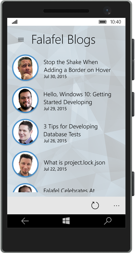
We�ll take a closer look at Visual States and how we achieved these different layouts for Falafel2Go in a future post.
Adding a Hamburger Menu
The SplitView control lends itself to the common UI pattern of a menu button, often referred to as the �hamburger button� to toggle the visibility of the Panel menu. This is especially useful in mobile devices which have limited real estate as shown in the Falafel2Go image above.
The SplitView does not natively expose such a control to toggle its visibility; instead the developer is responsible�for creating�this control on the canvas to�trigger the events. In Falafel2Go we achieved by simply adding a Button control to the Pane section:
<SplitView.Pane>

��� <StackPanel>

������� <Button x:Name="MenuButton" FontFamily="Segoe MDL2 Assets" Content="?" Style="{StaticResource SplitViewButton}" Click="MenuButton_Click" />

��������������� <!-- ... -->

������� </StackPanel>

</SplitView.Panel>
Notice that we're using the Segoe MDL2 Assets font, which contains a wide variety of glyph assets you can use for icons in your app.
In the Click event for the button, we simply update the DisplayMode properties of the SplitView to reveal or hide the menu as appropriate:
private void MenuButton_Click(object sender, RoutedEventArgs e)

��� {

������� PageSplitView.IsPaneOpen = !PageSplitView.IsPaneOpen;

��� }
Since on mobile, the Pane section is completely hidden when collapsed, we added another copy of the button to the canvas of the Content section, and use Visual States to show it only on mobile devies.
We also could have also leveraged the VisualStateManager to define this behavior declaratively in the XAML, but we'll look at that in a future topic.
Wrapping Up and Next Steps
The SplitView is a handy and welcome new control to the Windows developer toolbox, which makes it easy to create navigation menus and sidebars for your application that can automatically adjust to accommodate different platforms, orientations, and screen sizes. The two areas of content are clearly and intuitively declared in XAML and the Pane properties make it easy to customize the control to suit your application.
Up next, we'll take a look at how the new RelativePanel control was used in Falafel2Go to create the responsive start page for the app. Until then, as always, I hope this was helpful!