In the previous post we looked at the basics of UI automation in Windows 10 apps using Blend to declare the XAML for Visual States. However, while last time we used event handlers in the code-behind of a page to trigger different states, this time we'll see how to use the new AdaptiveTriggers in Windows 10 to let the application handle state transitions automatically.
StateTriggers
Each VisualState exposes a�StateTriggers�property, which is a collection of triggers that it uses to determine whether or not the state should be activated. These triggers�inherit from the�StateTriggerBase�class, which uses the�SetActive() method to set the active status of the parent VisualState, based on specific properties of the trigger in relation to the running application.
If all triggers resolve their value to true, the parent VisualState is activated.
AdaptiveTrigger
Windows 10 currently offers only a single trigger in the Framework: the�AdaptiveTrigger. This trigger exposes two properties (MinWindowWidth and�MinWindowHeight) that serve as screen size threshold values. When the screen is larger than the specified property (or properties, if they are both specified), the adaptive trigger sets active to true.
This behavior is demonstrated in Falafel2Go with the SplitView, which adapts across various sizes from fully open on a wide desktop:

a medium, collapsed panel for medium screens:
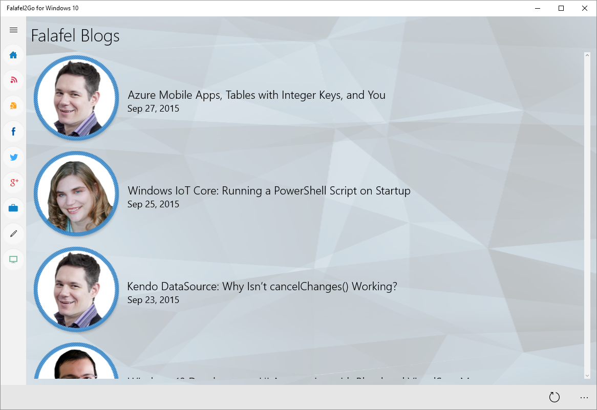
and finally hidden for narrow screens and mobile devices:
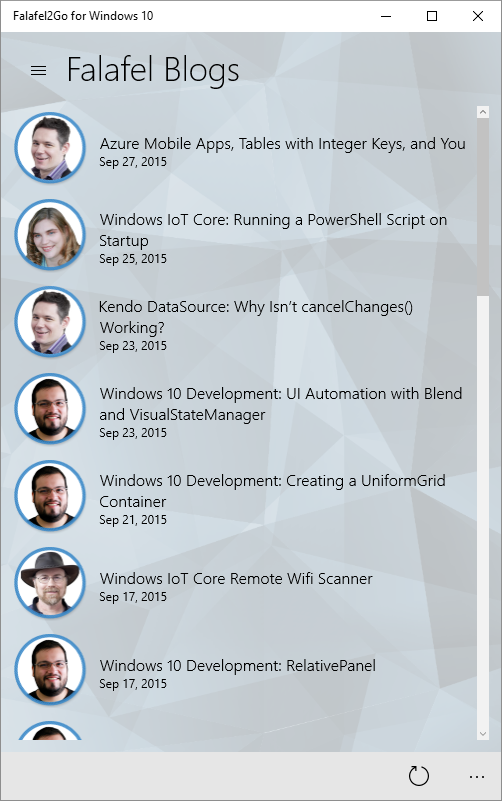
Defining Triggers with Blend
Once again we can leverage the design features and tools in Blend for Visual Studio to simplify the process of defining triggers by creating them visually in the designer.
In the States window, to the right of each declared VisualState is a button to launch a dialog to manage the triggers for that state.
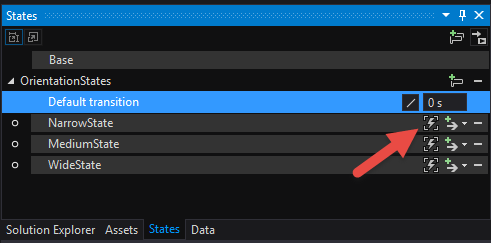
In this dialog you can select the native AdaptiveTrigger (as well as a custom trigger, which we'll see in the next post in this series) and add it to the collection.

Once the trigger is added you can select it in the list above, which exposes the related properties, allowing you to specify the conditions which enable the trigger:
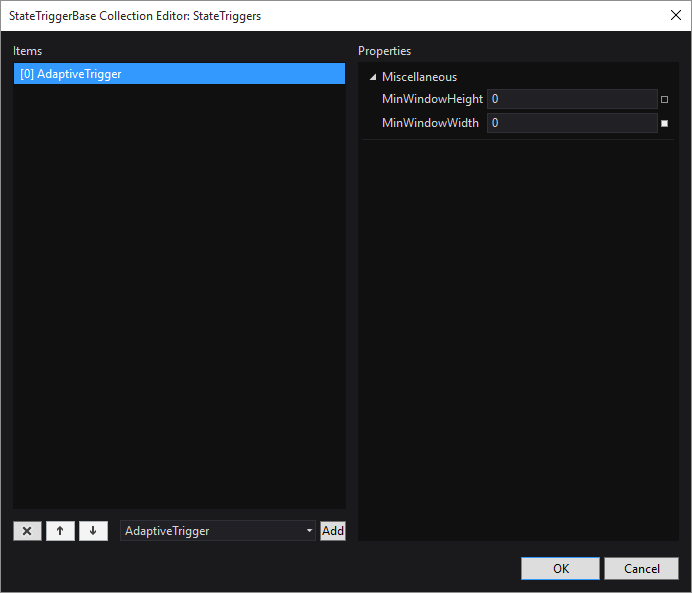
Repeating this process of adding triggers to each VisualState results in the�following XAML for the VisualStateManager, which describes the desired behavior:
<VisualStateManager.VisualStateGroups>

������� <VisualStateGroup x:Name="OrientationStates">

����������� <VisualState x:Name="NarrowState">

��������������� <VisualState.StateTriggers>

������������������� <AdaptiveTrigger MinWindowWidth="0" />

��������������� </VisualState.StateTriggers>

��������������� <VisualState.Setters>

������������������� <Setter Target="PageSplitView.DisplayMode" Value="Overlay" />

������������������� <Setter Target="MobileMenuButton.Visibility" Value="Visible" />

������������������� <Setter Target="BlogsListView.ItemTemplate" Value="{StaticResource SmallTemplate}" />

������������������� <Setter Target="BlogsListView.ItemsPanel" Value="{StaticResource VerticalTemplate}" />

��������������� </VisualState.Setters>

����������� </VisualState>

���� �������<VisualState x:Name="MediumState">

��������������� <VisualState.StateTriggers>

������������������� <AdaptiveTrigger MinWindowWidth="720" />

��������������� </VisualState.StateTriggers>

��������������� <VisualState.Setters>

������������������� <Setter Target="PageSplitView.DisplayMode" Value="CompactOverlay" />

������������������� <Setter Target="MobileMenuButton.Visibility" Value="Collapsed" />

������������������� <Setter Target="BlogsListView.ItemTemplate" Value="{StaticResource MediumTemplate}" />

������������������� <Setter Target="BlogsListView.ItemsPanel" Value="{StaticResource VerticalTemplate}" />

��������������� </VisualState.Setters>

����������� </VisualState>

����������� <VisualState x:Name="WideState">

��������������� <VisualState.StateTriggers>

������������������� <AdaptiveTrigger MinWindowWidth="1280" />

��������������� </VisualState.StateTriggers>

��������������� <VisualState.Setters>

������������������� <Setter Target="PageSplitView.DisplayMode" Value="Inline" />

������������������� <Setter Target="PageSplitView.IsPaneOpen" Value="True" />

������������������� <Setter Target="MobileMenuButton.Visibility" Value="Collapsed" />

������������������� <Setter Target="BlogsListView.ItemTemplate" Value="{StaticResource LargeTemplate}" />

��������� ����������<Setter Target="BlogsListView.ItemsPanel" Value="{StaticResource HorizontalTemplate}" />

��������������� </VisualState.Setters>

����������� </VisualState>

������� </VisualStateGroup>

��� </VisualStateManager.VisualStateGroups>
Notice in this case we're only specifying the width, and that the smallest definition for mobile has a minimum value of zero.
Although all states fulfill this condition, the VisualStateManager is smart enough to prioritize the definitions so that the wider values appropriately resize the control as the thresholds are reached.
It is also worth noting that you are not limited to simple properties when automating UI with VisualStates and Triggers. As you see in the screenshots above, while the medium and mobile screens orient the list of blog posts vertically, the largest state arranges them horizontally to take advantage of the larger space.
This is achieved by simply defining two ItemsPanelTemplates, using the VisualState and Triggers to swap them out on the fly:
<Page.Resources>

��� <ItemsPanelTemplate x:Key="VerticalTemplate">

������� <VirtualizingStackPanel />

��� </ItemsPanelTemplate>

��� <ItemsPanelTemplate x:Key="HorizontalTemplate">

������� <WrapGrid Orientation="Horizontal" />

��� </ItemsPanelTemplate>

��� <!-- ... -->

</Page.Resources>
Notice that in this case for the HorizontalTemplate I opted to use a WrapGrid since it will wrap items to the next line while the VirtualizingStackPanel does not.
The same strategy�is used�with the ListView�ItemTemplate, swapping out to a different as needed for the alternative layouts as needed to support the different screen sizes.
Wrapping Up and Next Steps
We used this strategy to achieve a responsive layout on all the screens, including the main activities page, which updates the RelativePanel attached properties to rearrange the buttons.
However, you may notice that we have a slight discrepancy in our responsive layout. While we have set a fixed width to trigger the different states, we haven't taken into consideration the height. As a result, while the main screen sizes appropriately if the layout is portrait, on a narrow screen we don't quite get the result we expect if the height is smaller than the width (landscape).
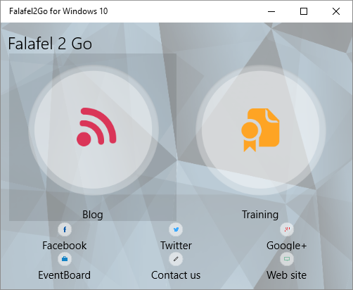
While we can certainly add additional AdaptiveTriggers to cover the different orientation options, we can simplify this process by instead creating our own custom trigger to combine these properties and reduce the complexity. We'll take a look at that in our next post.
Until then, as always I hope this was helpful and thanks for reading!