In our last post, we installed the MVVM Light Toolkit and defined the basic framework for a simple two-page app with the MVVM pattern.�With the ViewModels we created, we now have the containers for the data, but it would be even more helpful to pre-populate them with some sample�data to aid in the designing of the app.
Design-Time Data Support
Fortunately MVVM Light exposes a static property allowing the ViewModel code to detect whether or not it is running inside a visual designer such as Visual Studio or Blend. By leveraging this we can create a simple pattern for exposing design data through each ViewModel.
Also, since we likely are going to want design data on every page, we can add this to our BaseViewModel as a virtual method, running it via the constructor only when the designer is detected:
public BaseViewModel()

��� {

������� if (this.IsInDesignMode)

������� {

����������� LoadDesignTimeData();

������� }

��� }

������� protected virtual void LoadDesignTimeData() { }
Now for every model that requires sample data at design-time, we can simply override this method, and populate the necessary properties with fake data. Since this only runs when detected by the static designer property, the code will safely be ignored at runtime.
Here's what it looks like for the MainPage ViewModel, instantiating a list of sample TestItem objects:
protected override void LoadDesignTimeData()

������� {

����������� base.LoadDesignTimeData();

����������� for (var i = 1; i < 10; i++)

����������� {

��������������� var color = string.Join("", Enumerable.Repeat(i.ToString(), 6));

��������������� var testItem = new TestItem() { Id = i, Title = "Test Item " + i, Subtitle = "Subtitle " + i, HexColor = string.Concat("#", color) };

��������������� TestItems.Add(testItem);

����������� }

������� }
and again for the SecondPageViewModel, creating a single TestItem with more�sample data.
protected override void LoadDesignTimeData()

������� {

����������� base.LoadDesignTimeData();

����������� SelectedItem = new TestItem() { Title = "Design Time Selected Item", Subtitle = "Design subtitle", HexColor = "#333333" };

������� }
Now that we have sample data available at design time, we want to use it as a visual aid to update our views to properly layout and format the data. We can do this with the powerful companion tool Blend for Visual Studio.
Blend for Visual Studio
Visual Studio includes and automatically installs with Blend, a companion application that provides a designer-focused view of your Visual Studio projects. A full tour of Blend is outside the scope of this post, but I highly recommend that if you are new to Blend, you take the time to check out this course on Microsoft Virtual Academy: Designing Your XAML UI with Blend Jump Start. Although the course is specific to Blend 2013, virtually all of the content translates directly to VS2015, so it is well worth your time.
For now, we can jump directly into Blend from Visual Studio by right-clicking the MainPage.xaml in the Solution Explorer and selecting "Design in Blend": �
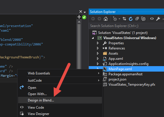
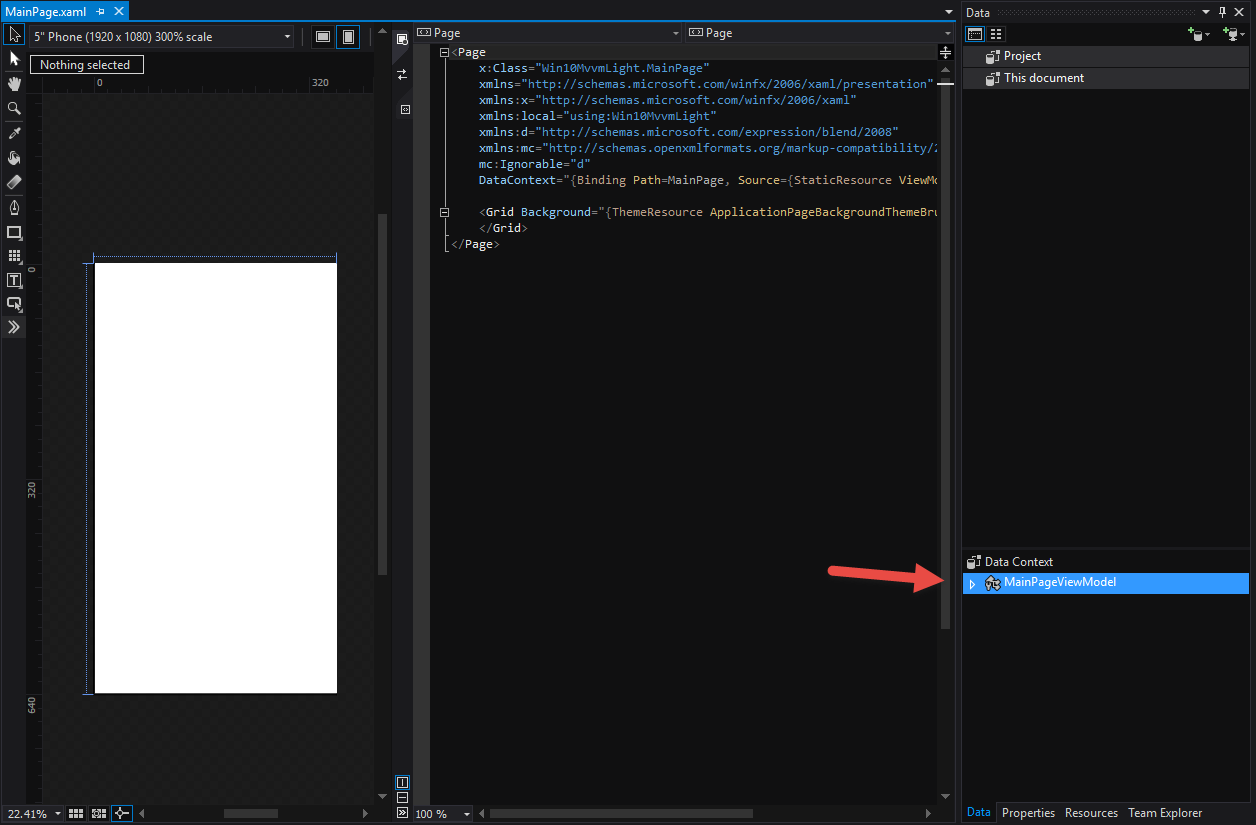
This reveals the same blank view of our MainPage�but also gives access to the wide variety of design tools offered by Blend. Specifically, we want to focus on the�Data�window for MainPage, revealing the DataContext of the page, strongly-typed to the associated MainPageViewModel.
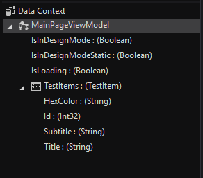
In fact, you'll notice that not only do we see the strongly-typed ViewModel, but all of its properties as well.
Among the�many helpful features of Blend is the ability to drag a property from the Data view directly onto the canvas to quickly generate a simple layout and template. In this case, for the MainPage we want to show the list of TestItems, so dragging that property directly onto the grid reveals a generated ListView and associated ItemTemplate:
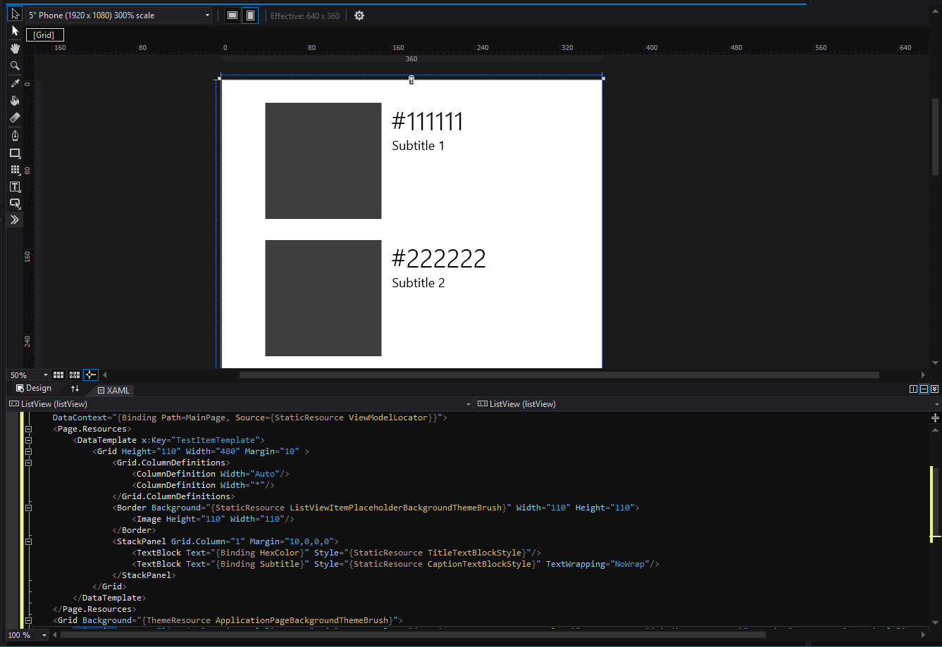
Obviously from the screenshot it can't anticipate all the properties and controls you'd want to use nor their correct placement, but with just a few minor changes to the generated template, we end up with the completed XAML for the MainPageView:
<Page

��� x:Class="Win10MvvmLight.MainPage"

��� xmlns="http://schemas.microsoft.com/winfx/2006/xaml/presentation"

��� xmlns:x="http://schemas.microsoft.com/winfx/2006/xaml"

��� xmlns:local="using:Win10MvvmLight"

��� xmlns:d="http://schemas.microsoft.com/expression/blend/2008"

��� xmlns:mc="http://schemas.openxmlformats.org/markup-compatibility/2006"

��� mc:Ignorable="d"

��� xmlns:model="using:Win10MvvmLight.Portable.Model"

��� DataContext="{Binding Path=MainPage, Source={StaticResource ViewModelLocator}}">

��� <Page.Resources>

������� <DataTemplate x:Key="TestItemTemplate">

����������� <Grid Height="110" Width="480" Margin="10" >

��������������� <Grid.ColumnDefinitions>

������������������� <ColumnDefinition Width="Auto"/>

������������������� <ColumnDefinition Width="*"/>

��������������� </Grid.ColumnDefinitions>

��������������� <Border Background="{Binding HexColor}" Width="110" Height="110">

������������������� <Image Height="110" Width="110"/>

��������������� </Border>

��������������� <StackPanel Grid.Column="1" Margin="10,0,0,0">

������������������� <TextBlock Text="{Binding Title}" Style="{StaticResource TitleTextBlockStyle}"/>

������������������� <TextBlock Text="{Binding Subtitle}" Style="{StaticResource CaptionTextBlockStyle}" TextWrapping="NoWrap"/>

��������������� </StackPanel>

����������� </Grid>

������� </DataTemplate>

��� </Page.Resources>

��� <Grid Background="{ThemeResource ApplicationPageBackgroundThemeBrush}">

������� <ListView x:Name="listView"

����������������� ItemTemplate="{StaticResource TestItemTemplate}"

����������������� ItemsSource="{Binding TestItems}"

����������������� Margin="19,12,19,0"

����������������� ItemClick="listView_ItemClick"

����������������� IsItemClickEnabled="True"/>

��� </Grid>

</Page>
We can follow the same steps for the SecondPage by dragging the individual properties from the Data view onto the controls to which you want to bind. However, there is another way to achieve the data binding for the page.
DataBinding Intellisense
Since we bound the ViewModel to the page declaratively (using the ViewModelLocator in our last post), the page is contextually aware of it, and Intellisense is smart enough to help us by exposing strongly-typed data-binding, as seen here updating the SecondPageView controls:
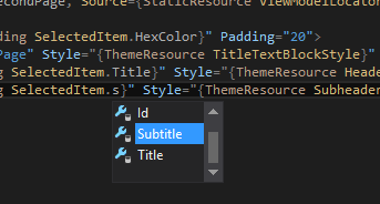
We can use this feature to bind the remaining properties on the page; here's the updated SecondPage XAML with all the databindings:
<Page

��� x:Class="Win10MvvmLight.Views.SecondPage"

��� xmlns="http://schemas.microsoft.com/winfx/2006/xaml/presentation"

��� xmlns:x="http://schemas.microsoft.com/winfx/2006/xaml"

��� xmlns:local="using:Win10MvvmLight.Views"

��� xmlns:d="http://schemas.microsoft.com/expression/blend/2008"

������� mc:Ignorable="d"

��� xmlns:mc="http://schemas.openxmlformats.org/markup-compatibility/2006"

��� DataContext="{Binding Path=SecondPage, Source={StaticResource ViewModelLocator}}">

��� <StackPanel Background="{Binding SelectedItem.HexColor}" Padding="20">

������� <TextBlock Text="Second Page" Style="{ThemeResource TitleTextBlockStyle}" Foreground="White" />

������� <TextBlock Text="{Binding SelectedItem.Title}" Style="{ThemeResource HeaderTextBlockStyle}" Foreground="White" />

������� <TextBlock Text="{Binding SelectedItem.Subtitle}" Style="{ThemeResource SubheaderTextBlockStyle}" Foreground="White" />

��� </StackPanel>

</Page>
And a screenshot of the designer showing the bound properties: We now have a helpful design-view of all of the pages in our app. This is very helpful if we want to make additional visual changes, enabling�immediate feedback in the designer without having to launch the app with live data to see the result.
Wrapping up and Next Steps
Although we still don't yet have a useable, running app, we've demonstrated how you can use both the MVVM Light Toolkit and the design features of Blend and Visual Studio to quickly layout the pages of an application. By following this pattern you can quickly define all the screens of your app without every having to run it, which is especially helpful when your app is still in the design phase.
Of course, launching the app still reveals a blank page, since we have only created design-time data.
In our next post, we'll look at a simple yet naive strategy for both runtime data and navigation to get the app to a usable state. Later, we'll reveal how to refactor that code into a more elegant and portable solution with more help from the MVVM Light Toolkit.
Until then you can grab this post's version of the sample project here:
Get the CODE!
and as always, I hope this was helpful, and thanks for reading!