This post describes the need for and implementation of a UniformGrid layout control that, when used with a ListView, allows the repeated elements to appropriately stretch to a consistent size to achieve a grid-like layout.
Grid Layouts: Simple�but Static
In our last post we looked at the new RelativePanel control, which we used in the Falafel2Go app for Windows 10 to create a dynamic, responsive layout for the home screen: �
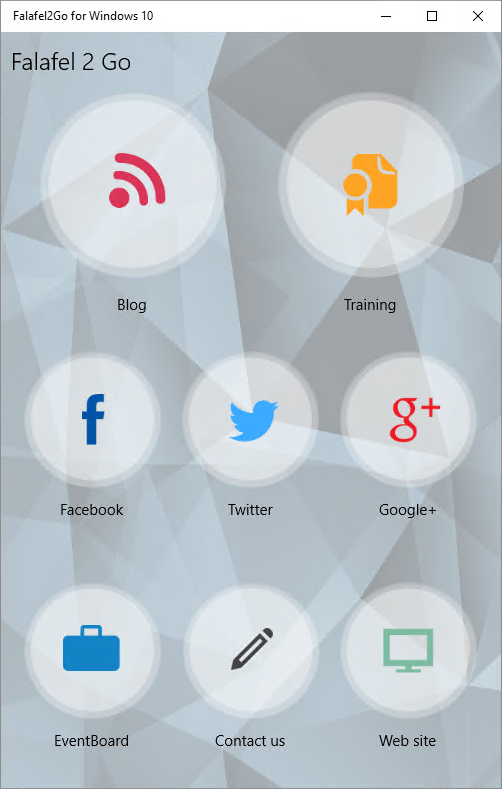
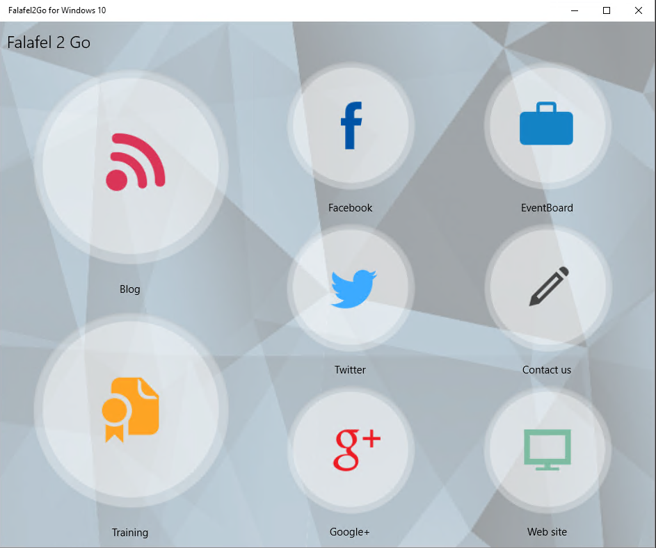
You'll notice that in most of the orientations, the Blog and Training elements are featured and grouped together, and therefore render a bit larger than the others. A static layout like this isn't difficult to achieve. In fact, the previous version of this app (built with Xamarin Forms) used nested Grid controls to achieve the layout.
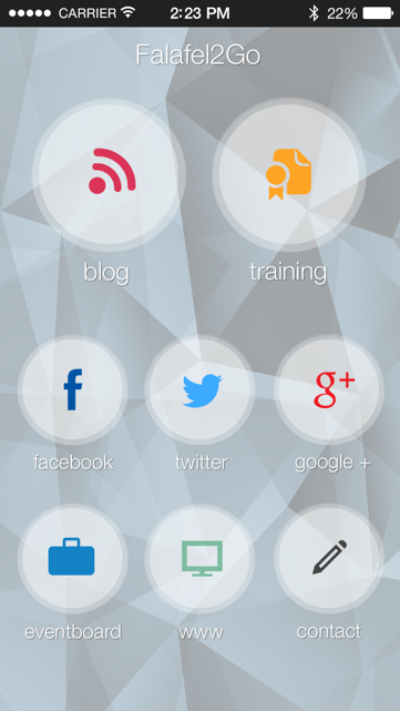
You can read more about this approach here:�Beyond the ListView: Fancy Layouts with Xamarin Forms
However, as we touched on in our post on the RelativePanel, the Grid doesn't easy lend itself to dynamic and flexible layouts. Even something as simple as offering a landscape mode can be a challenge:

Another limitation of using Grid controls was that we could not bind to the list of activities; instead each activity was hard coded into a specific cell in the Grid layout.
It's not obvious from the Falafel2Go for Windows 10 screenshots, but the activities are actually bound to seperate ListView controls, one for the featured Blog and Training sections, and the other to the remaining activities.
This is what it looks like in the XAML, using a RelativePanel to allow the featured list to reorient itself:
<RelativePanel Grid.Row="1">

��������� <ListView x:Name="MainPanel" Style="{StaticResource ActivitiesListView}" ScrollViewer.VerticalScrollMode="Disabled"

��������������������� RelativePanel.AlignTopWithPanel="True">

��������������� <ctrl:ActivityControl DataContext="{Binding Blog}"�� />

������� <ctrl:ActivityControl DataContext="{Binding Training}"��� />

����� </ListView>

��������� <ListView x:Name="OtherActivitiesPanel" Style="{StaticResource ActivitiesListView}" ScrollViewer.VerticalScrollMode="Disabled"

��������������������� RelativePanel.Below="MainPanel" RelativePanel.AlignBottomWithPanel="True" RelativePanel.AlignRightWithPanel="True">

��������������� <ctrl:ActivityControl DataContext="{Binding Facebook}"�� />

������� <ctrl:ActivityControl DataContext="{Binding Twitter}"��� />

������� <ctrl:ActivityControl DataContext="{Binding Google}"���� />

������� <ctrl:ActivityControl DataContext="{Binding Eventboard}" />

������� <ctrl:ActivityControl DataContext="{Binding Contact}"��� />

������� <ctrl:ActivityControl DataContext="{Binding Website}"��� />

����� </ListView>

</RelativePanel>
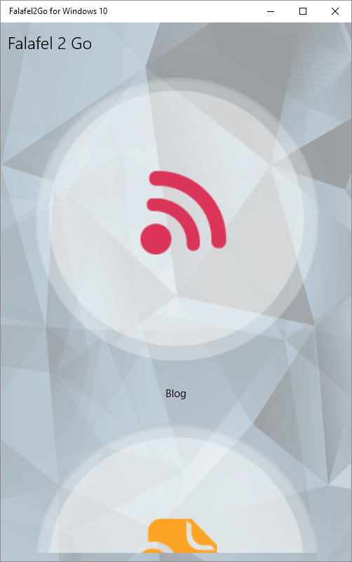
The problem with this XAML is that we declared the ActivityControl in such a way that the Icon would fill the area above the label, so without any kind of constraints, it's going to stretch to fill the entire screen, yielding an unexpected layout for the screen:
We experimented with different solutions, such as adding properties to set the width and height values of the images. However, since the dimensions would vary wildly based on the screen orientation and size, this proved very cumbersome,. Ultimately we were unable to find a consistent way to handle all possible orientations using the default toolbox for Windows 10.
What we needed was a way for the items in the ListView to automatically calculate their size based on the orientation and available space.
Changing the�Container
We made some progress by�overriding the ItemsPanelTemplate, which represents the container panel for the ListView By default this is defined as an�ItemsStackPanel, which we can modify by adding a property in the XAML:
<ListView x:Name="MainPanel" Style="{StaticResource ActivitiesListView}" ScrollViewer.VerticalScrollMode="Disabled" RelativePanel.AlignTopWithPanel="True">

��������������� <ListView.ItemsPanel>

����������� <ItemsPanelTemplate>

��������������� <ItemsStackPanel Orientation="Horizontal" />

����������� </ItemsPanelTemplate>

������� </ListView.ItemsPanel>

������� <ctrl:ActivityControl DataContext="{Binding Blog}"�� />

������� <ctrl:ActivityControl DataContext="{Binding Training}"��� />

��� </ListView>
However, simply changing the orientation to Horizontal wasn't enough, since we still have the problem of the activity control wanting to stretch to fill the height. This�leaves no room for the other ListView beneath and almost no room for the second Training button on the right:

We�needed a different container, one�that can resize its contents automatically, something like the�UniformGrid�which�was available in WPF, but unfortunately was not ported to WinRT.
Creating a UniformGrid
The solution was to build our own version of the UniformGrid. We found several helpful resources along the way, including�Greg Stoll's Universal Wrap Grid, available on GitHub here:�https://github.com/gregstoll/UniversalWrapPanel
Another excellent source of help was this article from Olivier Matis:�Create a panel to give all GridView items the maximum width/height�which had the breakthrough revelation that by default, ListViewBase controls like ListView and GridView will always use the�first item in the list to auto-size the remaining items.
To overcome this, we need to inherit our control from�Panel and override the�MeasureOverride�and�ArrangeOverride�methods, which are the two key events fired by Layout controls to render the children items in the container.
public class UniformGrid : Panel

��� {

������� protected override Size MeasureOverride(Size availableSize)

������� {

����������� double finalWidth, finalHeight;

����������� // ...

����������� return new Size(finalWidth, finalHeight);

������� }

������� protected override Size ArrangeOverride(Size finalSize)

������� {

����������� // ...

����������� return finalSize;

������� }

��� }
We need to use the�MeasureOverride event to actual size of the individual activity controls that each ListView will present, finally returning the overall size of the container (and therefore the parent ListView). Next, the�ArrangeOverride will take those controls and position them in the control, laying them out at specific coordinates calculated from the size of each control.
The result is a uniformly sized and spaced arrangement that takes up exactly the right amount of room based on the screen size.
At this point you're probably wondering how to perform the actual calculation. That is, what are we using as a guide to size the controls in the overrides? There are many ways to do this, including the default way of simply calculating the rendered size of the first item in the list. Alternatively, the GridView sample linked above calculates the resulting grid when�each item is placed in a column, moving items to a new column when the maximum height�of the container is reached. The final size of that resulting container is then used to render the controls within based on that calculated size.
In the case of Falafel2Go, while we wanted the controls to size dynamically, we also knew that the grouping of items was fixed: 2 items in the top container, and rows of three in the bottom. So instead of letting the controls drive the calculation, we added properties to specify either the number of Columns (when using a Horizontal Orientation) or the number of�Rows (when using a Vertical Orientation).
public int Columns

������� {

����������� get { return (int)GetValue(ColumnsProperty); }

����������� set { SetValue(ColumnsProperty, value); }

������� }

������� public int Rows

������� {

����������� get { return (int)GetValue(RowsProperty); }

����������� set { SetValue(RowsProperty, value); }

������� }

������� public Orientation Orientation

������� {

����������� get { return (Orientation)GetValue(OrientationProperty); }

����������� set { SetValue(OrientationProperty, value); }

������� }

������� public static readonly DependencyProperty ColumnsProperty =

������� DependencyProperty.Register("Columns", typeof(int), typeof(UniformGrid), new PropertyMetadata(1, OnColumnsChanged));

������� public static readonly DependencyProperty RowsProperty =

������� DependencyProperty.Register("Rows", typeof(int), typeof(UniformGrid), new PropertyMetadata(1, OnRowsChanged));

������� public static readonly DependencyProperty OrientationProperty =

DependencyProperty.Register("Orientation", typeof(Orientation), typeof(UniformGrid), new PropertyMetadata(1, OnOrientationChanged));

������� static void OnColumnsChanged(DependencyObject obj, DependencyPropertyChangedEventArgs e)

������� {

����������� int cols = (int)e.NewValue;

����������� if (cols < 1)

��������������� ((UniformGrid)obj).Columns = 1;

������� }

������� static void OnRowsChanged(DependencyObject obj, DependencyPropertyChangedEventArgs e)

������� {

����������� int rows = (int)e.NewValue;

����������� if (rows < 1)

��������������� ((UniformGrid)obj).Rows = 1;

������� }

������� static void OnOrientationChanged(DependencyObject obj, DependencyPropertyChangedEventArgs e)

������� {

������� }
Using these dependency properties, we can replace the ItemsPanelTemplate with our UniformGrid and tell it exactly how many rows or columns it should use when rendering the list.
<RelativePanel Grid.Row="1">

��� <ListView x:Name="MainPanel" Style="{StaticResource ActivitiesListView}" ScrollViewer.VerticalScrollMode="Disabled"

��������������� RelativePanel.AlignTopWithPanel="True">

������� <ListView.ItemsPanel>

������� <ItemsPanelTemplate>

����������� <ctrl:UniformGrid Columns="2" Orientation="Horizontal" />

������� </ItemsPanelTemplate>

��� </ListView.ItemsPanel>

��� <ctrl:ActivityControl DataContext="{Binding Blog}"�� />

��� <ctrl:ActivityControl DataContext="{Binding Training}"��� />

��� </ListView>

��� <ListView x:Name="OtherActivitiesPanel" Style="{StaticResource ActivitiesListView}" ScrollViewer.VerticalScrollMode="Disabled"

��������������� RelativePanel.Below="MainPanel" RelativePanel.AlignBottomWithPanel="True" RelativePanel.AlignRightWithPanel="True">

������� <ListView.ItemsPanel>

����������� <ItemsPanelTemplate>

��������������� <ctrl:UniformGrid Columns="3" Orientation="Horizontal" />

����������� </ItemsPanelTemplate>

������� </ListView.ItemsPanel>

������� <ctrl:ActivityControl DataContext="{Binding Facebook}"� �/>

������� <ctrl:ActivityControl DataContext="{Binding Twitter}"��� />

������� <ctrl:ActivityControl DataContext="{Binding Google}"���� />

������� <ctrl:ActivityControl DataContext="{Binding Eventboard}" />

������� <ctrl:ActivityControl DataContext="{Binding Contact}"��� />

������� <ctrl:ActivityControl DataContext="{Binding Website}"��� />

��� </ListView>

</RelativePanel>
At last we can implement�the�MeasureOverride and�ArrangeOverride to calculate the controls based on the number of items that should go in each row or column.
protected override Size MeasureOverride(Size availableSize)

{

��� double finalWidth, finalHeight;

��� if (this.Orientation == Orientation.Horizontal)

��� {

������� finalWidth = availableSize.Width;

������� var itemWidth = Math.Floor(availableSize.Width / Columns);

������� var actualRows = Math.Ceiling((double)Children.Count / Columns);

������� var actualHeight = Math.Floor((double)availableSize.Height / actualRows);

������� var itemHeight = Math.Min(actualHeight, itemWidth);

����� ��foreach (var child in Children)

������� {

����������� child.Measure(new Size(itemWidth, itemHeight));

������� }

������� finalHeight = itemHeight * actualRows;

��� }

��� else

��� {

������� finalHeight = availableSize.Height;

������� var itemHeight = Math.Floor(availableSize.Height / Rows);

������� var actualColumns = Math.Ceiling((double)Children.Count / Rows);

������� var actualWidth = Math.Floor((double)availableSize.Width / actualColumns);

������� var itemWidth = Math.Min(actualWidth, itemHeight);

�� �����finalWidth = itemWidth * actualColumns;

������� foreach (var child in Children)

������� {

����������� child.Measure(new Size(itemWidth, itemHeight));

������� }

��� }

��� return new Size(finalWidth, finalHeight);

}

protected override Size ArrangeOverride(Size finalSize)

{

��� if (this.Orientation == Orientation.Horizontal)

��� {

������� var actualRows = Math.Ceiling((double)Children.Count / Columns);

������� var cellWidth = Math.Floor(finalSize.Width / Columns);

������� var cellHeight = Math.Floor(finalSize.Height / actualRows);

������� Size cellSize = new Size(cellWidth, cellHeight);

������� int row = 0, col = 0;

������� foreach (UIElement child in Children)

������� {

����������� child.Arrange(new Rect(new Point(cellSize.Width * col, cellSize.Height * row), cellSize));

����������� var element = child as FrameworkElement;

����������� if (element != null)

����������� {

��������������� element.Height = cellSize.Height;

��������������� element.Width = cellSize.Width;

����������� }

����������� if (++col == Columns)

����������� {

��������������� row++;

��������������� col = 0;

����������� }

������� }

��� }

��� else

��� {

������� var actualColumns = Math.Ceiling((double)Children.Count / Rows);

������� var cellWidth = Math.Floor(finalSize.Width / actualColumns);

������� var cellHeight = Math.Floor(finalSize.Height / Rows);

������� Size cellSize = new Size(cellWidth, cellHeight);

������� int row = 0, col = 0;

������� foreach (UIElement child in Children)

������� {

����������� child.Arrange(new Rect(new Point(cellSize.Width * col, cellSize.Height * row), cellSize));

����������� var element = child as FrameworkElement;

����������� if (element != null)

����������� {

��������������� element.Height = cellSize.Height;

��������������� element.Width = cellSize.Width;

� ����������}

����������� if (++row == Rows)

����������� {

��������������� col++;

��������������� row = 0;

����������� }

������� }

��� }

��� return finalSize;

}
Notice here that we're using the same values from the calculated width (for horizontal layouts) to populate the height, so that the actual space occupied is a square (and therefore, uniform). The same goes for the calculated height (for vertical layouts) to assign an equal width.
As a result, because the featured ListView for Blogs and Training only have two items, they will use half the width of the screen (as opposed to one-third for the ListView items below) and we are guaranteed that they will render larger, no matter what the size of the screen is, even as we drag it freely (click the image below to see the animated gif)!

When�the screen is oriented horizontally (with width being larger than height), the relative panel adjusts to place the featured buttons to the left, and orients the list vertically, giving 50% of the height to each button.

We'll see how we achieved this automation in our next post.
Wrapping Up and Next Steps
By default, the ListViewBase controllers like ListView and GridView size the item containers based on the first item in the list. This is problematic if you have variable-sized items in the list, or�if you want the items to be uniformly sized relative to the container (rather than their contents).
Creating a UniformGrid control solves this by customizing the�MeasureOverride�and ArrangeOverride events of the Panel that are responsible for sizing and arranging its contents.
We can take this one step further and allow the control to automatically re-orient itself between columns and rows while maintaining the fixed distribution in either direction. This can be done by leveraging the VisualStateManager, which is the subject of our next post.
Until then, as always, I hope this was helpful, and thanks for reading!